Last night Laura took me to the Steelback Centre to see the Greyhounds take on the Saginaw Spirit. When I walked in on opening night I was awed by the beautiful building, but now that I've had a chance to digest, I'm afraid to say the SBC is lacking in atmosphere. It may be the design but it seems really quiet a lot of the time. In the Gardens the steep slope of the stands seemed to keep the fans looming over the players and there was always an audible buzz throughout the crowd. At the Gardens you seemed part of the game. In the SBC you're very detached. But I guess you can't compare 50 years of character to a couple of games. To the SBC's credit the Hall of Fame wall is a nice touch.
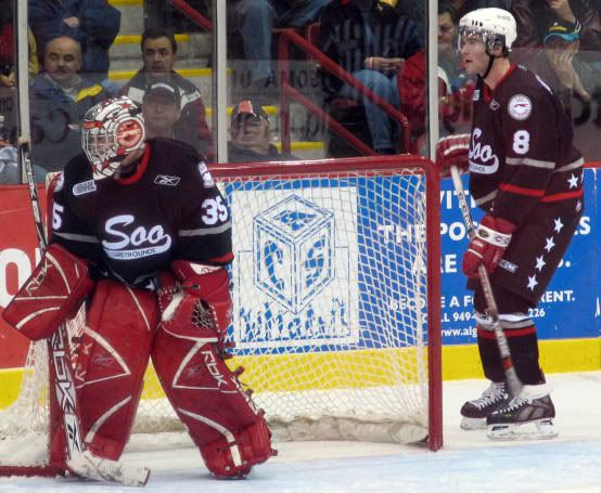
Anyway, the Hounds debuted their third jerseys which can be seen here courtesy of www.soonews.ca :
 I gotta say I'm not a fan of these. They're okay I guess but black (or is it really dark blue - I couldn't tell) for a sweater is played out. Also, the "Soo" script is more suited for baseball. I heard that it was a nod to some team of the past but to me it just seems pedestrian.
I don't want to make this post all negativity but I should talk about the game. The Hounds ended up losing 5-4. Overall it was pretty entertaining (they tied it up 4-4 after being down 3-1) but their power play is horrendous and they do not seem to have the ability to clear their zone. Both teams scored some really pretty goals and there were a few good hits. When Hartsburg started listening to me and playing #19 more things started looking up for the Hounds. Laura took notes on the positional play. Why? (to be continued...)


2 Comments:
I'm iffy on those jerseys as well. From the picture here it looks like a dark maroon, almost Peteborough Pete colours and to that I saw "eewww".
If they are black and red they might be better but I don't get them yet either, then again I haven't seen them in person.
They're not maroon (eww is right). They just seem so boring?
Post a Comment
<< Home